PHOTOSHOP TEST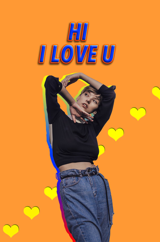
|
For this photoshop picture, I first grabbed a stock photo from online and used the quick selection tool to select the girl and delete the background. I then filled the background with an orange colour, and added text on top. I used many layer styles to edit the text such as a drop shadow, stroke, and bevel & emboss. I also used a layer style to edit the girl and give her a gradient overlay. I copied the image, put a custom gradient overlay then sent it behind the first girl. Lastly, I used the custom shape tool to create hearts, and used the bevel & emboss and inner glow styles to make it appear as if it was a cut out. |
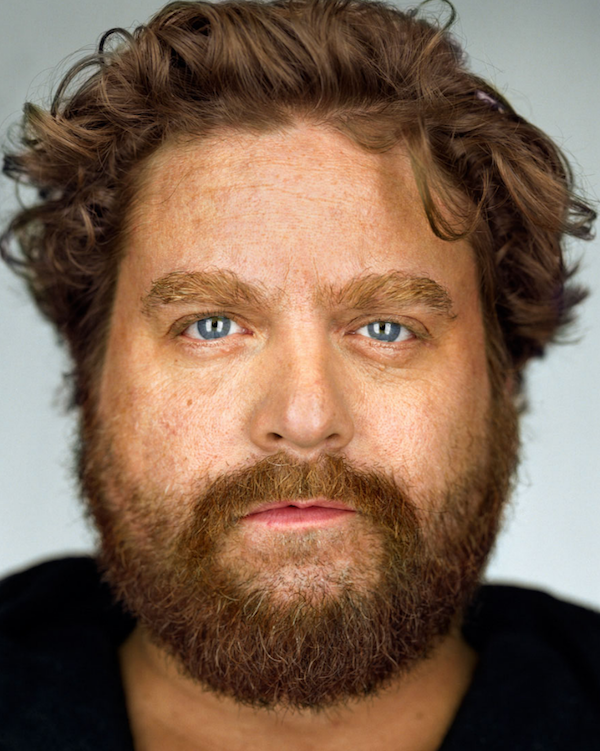
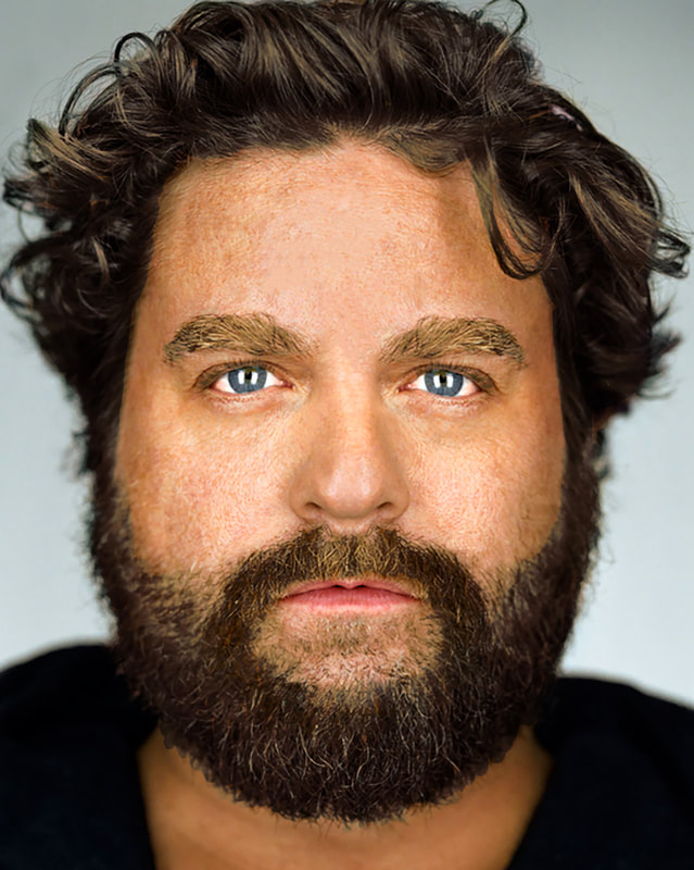
ZACK GALIFIANAKIS
|
|
This is a photo of Zack Galifianakis that we edited using photoshop. We started by fixing his mouth, eyes, and nose using the marquee tool to fix the symmetry. Then, we edited his skin and facial hair using the patch and healing brush tool to make the skin clearer, the beard fuller, and the eyebrows more defined. Finally, enhanced his eye colour using the adjustments bar and then changed his hair colour using a layer mask.
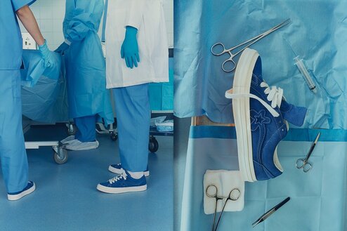
SHOE ADVERTISEMENT INSPO
|
This first advertisement is the Converse x Golf Wang One Star Le Fleur
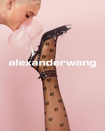
for the Blue colour way. I really like this ad because it's very creative and is different than most posters. I love that it is in a scene, and shows the shoes on feet in a very unlikely environment. I also like the blue background and details that go with the shoe, and it makes this ad look almost cinematic. I think the shoe with the different surgery tools surrounding it is clever as it almost depicts the shoe as being directed or something. This ad is very playful but thought out, and is staged in a way that makes it very interesting and unique. I admire Tyler, The Creator's creativity in this ad and I think it's different from most shoe ads that we see today. This next advertisement is by Alexander Wang. I admire this for it's simplicity but playfulness, and I think most of the creative work is in the photography for this one. I like the contrast between the dark shoe and light, airy colours in the background. I also think the gum gives a funny, playful twist and provides interest, and is almost ironic as you would think the shoe would pop the gum. I also like the classic Alexander Wang text, and I think it was smart to keep their signature font to maintain their brand identity and make it familiar to it's existing consumers. I think the poster and the colours in it are very cohesive and flow together nicely; providing the right amount of contrast and interest to grab the viewer's attention. Lastly, I like that the shoe is centered so you know it's the main focus of the poster and it what you see first.
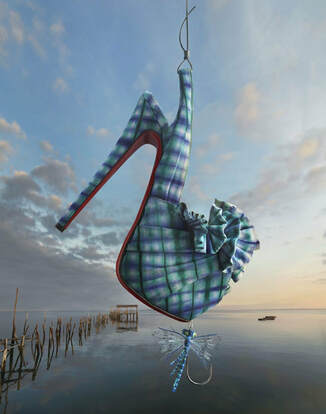
This last poster is by Louboutin, and provides a very cool concept and idea. I like this poster because it has a cool idea behind it, being that the shoe acts as a fish on a hook. I think the colours flow really nicely and still allow the shoes to stand out. I like how the show is fully in focus a little more than the rest of the background, and it is clearly the focus in the poster. I think the idea of the fishhook is very creative and playful and makes the poster very interesting and appealing to viewers. I think the scale of the shoe being a little bigger is a great way to capture attention, and I think the lack of words on the poster makes it much more pronounced and ambiguous, so people will be more drawn to it to see what the poster is all about. Lastly, I admire how this poster was able to use a luxary shoe brand and bring it down to earth by using a fishing scene, while still keeping it very interesting and artistic. |
|
|
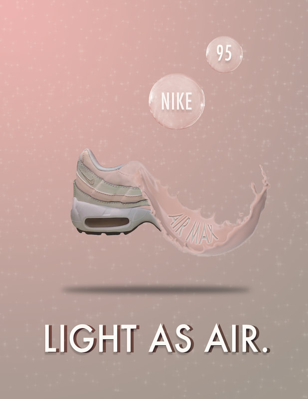
These are the shoe advertisements that I created for the Nike Air Max 95s. I wanted to keep the same colour scheme as the shoe, so both posters include mostly pinks, greys, and whites. I started the first poster by cutting around the original photo of the shoe to get rid of the background and adjusted the brightness. I then placed them facing each other and used flame brushes on the sole of the shoe and made sure they fit with the light colour scheme. I added a reflection action to each shoe to make them look like they were resting on glass. Then, I took a photo of a bubble off the internet and edited it to be transparent. I used a sparkle png and cropped it using a circular marquee tool to fit behind the bubble. Then, I used the shoe with the multiply filter and adjusted the opacity to go behind the bubble. I added text on top of the bubble, and added some layer styles. I also made other bubbles using the shape tool, and made the background have a gradient. Finally, I used the text tool to type on a path so the "take the heat" would be on a bottom arch, duplicated the layer, and added the multiple blend mode. For the second poster, I used a similar gradient and sparkles in the background, as well as the bubbles. For the paint effect, I went through some steps to manipulate and delete parts of the shoe, then added in a paint splatter png and changed it's colour. Then, I used layer styles to make it look like "air max" was in the paint, and added more writing at the bottom of the poster which I duplicated to give a 3D effect.
PERSONALITY POSTER
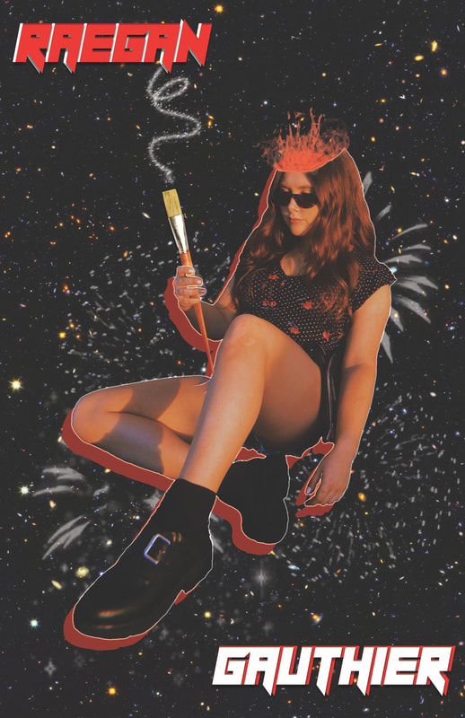
This is the personality poster I made using photoshop, which turned out a bit less vibrant than the actual photoshop document when I saved as a JPEG (this is because the colour system is CMYK since it's made for print, so the colours are different and less bright because it's not made for web). To make this poster, I started by using the magic wand tool to cut the background out of my photo. I then duplicated the layer, and made the second layer red using a colour overlay. Next, I put an outerglow on the first layer to make a white outline, and I cut off part of my head and used a fire brush to add flames to add a bit of an artistic touch. I used a galaxy background because I love learning about space, and added some fireworks in the back using a brush to represent how I am energetic and always busy. I used a bold font and duplicated it to make it more 3D. In the original photo, I was holding my phone, so I cut it out using the magic wand and adjusted the layers, then I added a paint brush to show my creativity. This is more of a conceptual personality poster and I wanted to make it more artistic rather than just putting my interests and things I enjoy.
