CIRCLES AND OVALS
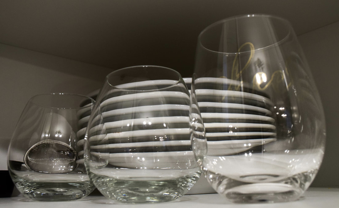
This photo has a longer depth of field because most of the subjects are all in focus. It is more bottom weighted because of the low camera angle, and the perspective is slightly skewed because of the distortion of the plates behind the glasses. I adjusted the exposure, white balance, clarity, and sharpness to capture the details of the light hitting the glasses and to make them more prominent. I also adjusted the whites to make them brighter and the darks darker to provide an interesting contrast. The photo has asymmetrical balance because it isn't equal on both sides, but the plates make it look more balanced overall since they're behind all 3 glasses. The plates also provide leading lines that draw the eye to the glasses, as well as the beams of light in each glass also do. The way the glasses are placed also give an interesting illusion of tall to short, and the minimal negative space make the composition more focused in on the subjects.
|
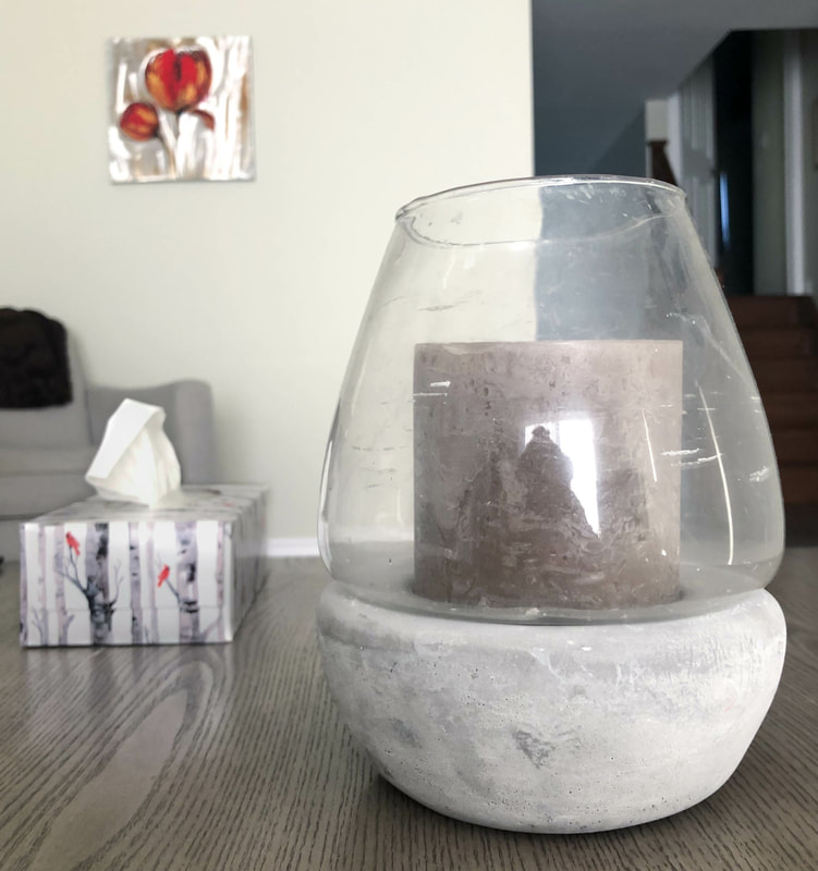
This photo has a shallow depth of field because the candle (closest to camera) is in focus while the other objects are not. The neutral greys and whites paired with the red on the tissue box and the picture unify the objects. I edited the exposure and clarity on the candle to make it brighter and to see the texture at the base, and I made the highlights and exposure on the tissue box less prominent so the main focus could be the candle. The leading lines on the wooden table lead the eye to the subjects, and the horizontal lines on the stairs also lead to the main subject. This composition has ideal dynamics because of the placement of the candle, tissue box, and picture and because the candle is off centre and more right weighted. The eye goes from the candle, to the tissue box, then the picture frame and then back to the candle.
|
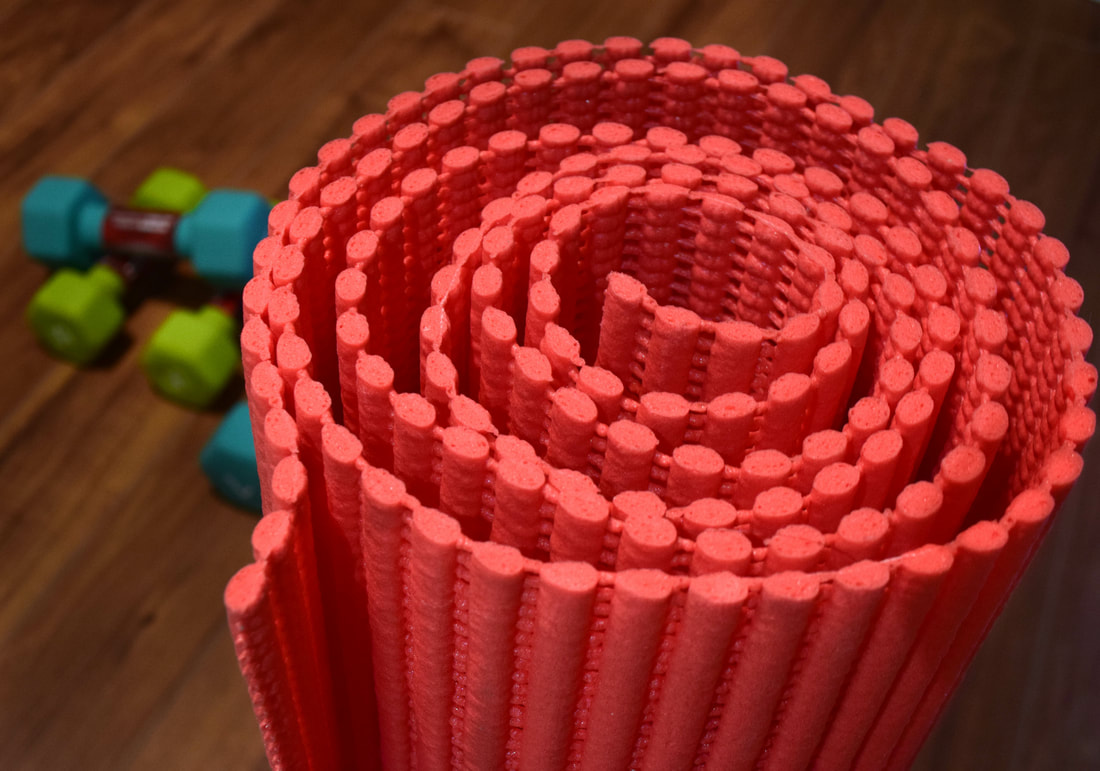
This photo has a shallow depth of field because of the blurred background and super focused subject. This is done with a large aperture and fast shutter speed. I placed objects with a green tone in the background because they are complimentary with the red mat and create contrast that draws the viewer in to explore the photo. I edited the contrast, clarity, and exposure to see the texture on the mat. The photo has asymmetrical balance because of the dumbbells on the side. The placement of the mat is more right weighted, and the secondary subjects pop in the back left which gives the photo more balance. The leading lines on the wood and on the mat lead the eye to each subject, and the lack of negative space draws the viewer to the subjects immediately.
|
PATTERNS
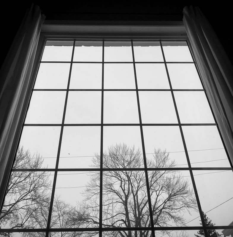
This is a photo of a window at the front of my house. I chose to shoot this photo because it has a line pattern that also has strong leading lines, and I shot it from a lower angle. In post production, I first cropped out the rest of the ceiling and surrounding area. I made the photo black and white and raised the contrast to make the lines darker and more prominent. I also made the whites in the background whiter to make the photo more interesting and contrasted.
|
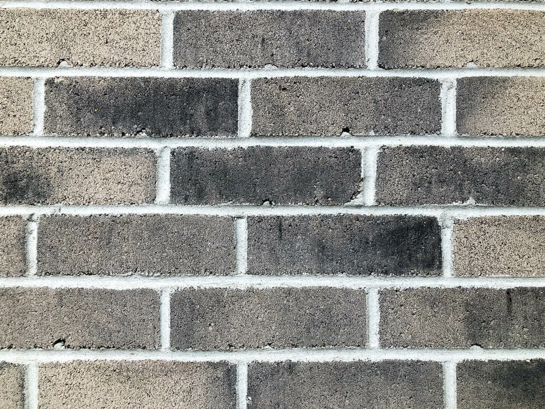
This photo is of the brick pattern on the side of my house. It is very static, but still interesting because of the texture and different colours in the bricks. In post production, I adjusted the white balance a little bit and raised the clarity and sharpness to see the texture more clearly. I also raised the contrast and exposure, and made the whites whiter and blacks darker to make the photo more vibrant.
|
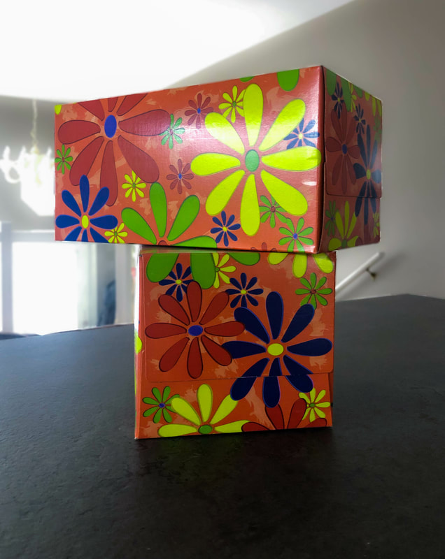
This is a photo of kleenex boxes with a cool flower pattern. I took them with a shallow depth of field, which means the aperture was large and the shutter speed was fast, which made the background blurred and the subject in focus. In post production, I blurred the background even more by adjusting the clarity. I also made the boxes more saturated and vibrant, and adjusted the white balance to get the right tone.
|
Bottles
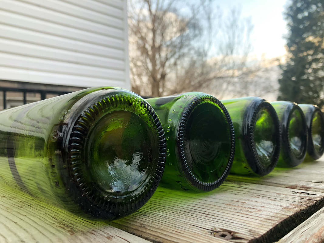
This photo was taken with a shallow depth of field since the bottles in the background are less focused than the ones in front. In post production, I edited the white balance, contrast, exposure, and saturation. I also used the brush tool to sharpen and give more clarity to the first two bottles and to make them stand out more and to show the texture.
|
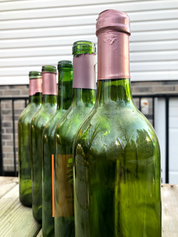
This photo was taken as portrait oriented to show the height of the bottles. I edited the white balance, cropped the photo, and brought up the contrast and exposure. I also used a brush to remove my reflection in the bottle, and to change the colour of the paper on the second bottle to match the rest (it was blue before).
|
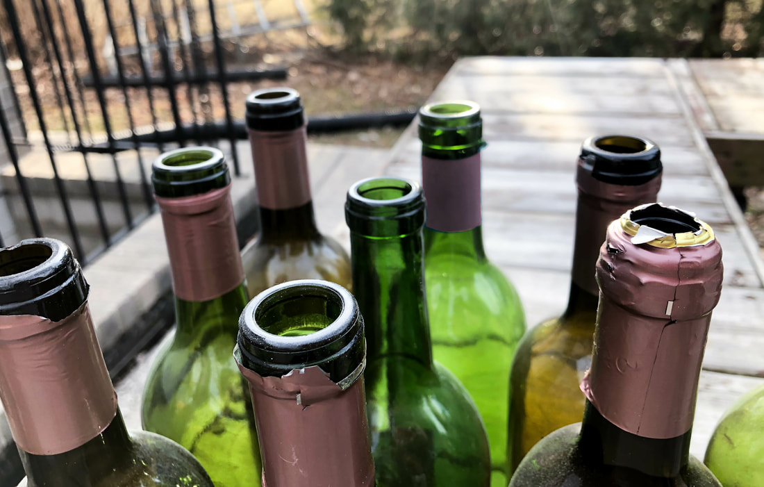
This photo was taken from a higher angle to show the reflection of light from the sun onto the lip of the bottles. I raised the exposure and highlights, and also the contrast to show the different colours on the bottles and make them stand out. I also used a brush to smooth over some of the bottles because they were dusty, and I also used a brush to change the colour on the paper of one of the bottles.
|
Shoes
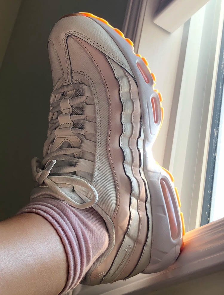
This photo was taken when my foot was on the window sill. I thought this was an interesting angle as the light was shining onto the sole and making it glow. In post production, I started by cropping the photo and adjusting the brightness and contrast. I also used a brush tool to remove any spots or stains on the shoe, and smoothed the skin on the ankle. I also fixed the white balance and temperature, and made the whites on the shoe whiter so it would stand out.
|
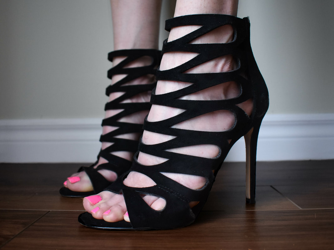
This photo was taken on a low angle to be eye level with the shoes. It has a shallow depth of field as the shoe closest to the camera is most in focus. I cropped and adjusted the orientation of the photo, then removed any spots in the back. Next, I darkened the wood to blend better with the black shoes using a brush. I then enhanced the blacks, contrast, and vibrance to make the black shoes stand out on the pale skin and pink toes. I chose to use these shoes because they had an interesting pattern and provide great contrast between the skin and shoes in the holes of the pattern.
|
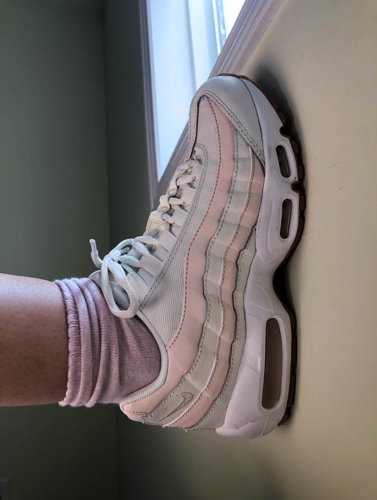
This photo was taken when my foot was pressing against the wall. I think this photo is interesting because the colour of the wall looks good with the shoe colours and the lighting was perfect. In post production, I enhanced the exposure and brightened the whites, as well as corrected any spots or imperfections on the wall and shoe. I also smoothed the skin with a brush on my ankle, and darkened the shadows a touch. I also added a bit more saturation and a little vignette to give more focus on the shoe.
|
